
Safe skies
For anyone suffering from aviophobia, a fear of flying, good news: 2017 was the safest year on record for commercial flight. Progress on air safety has been swift. Just a decade ago, 21 accidents resulted in more than 700 fatalities. Compare that with last year, when 10 accidents culminated in the deaths of just 44 passengers, proving that commercial flight is statistically the safest way to travel.

An easy way to explaining the low number of accidents in the page.


A couple views of the print page result

Thanks for the visit!
All the illustrations and graphics shown in this link are under the copyright of the South China Morning Post.
Graphic with Reuters

The Godfather at 50

Ghent Altarpiece

Raining cats and dogs

City of Anarchy

Penned in: the state of Hong Kong’s opposition

Sixteen years of Angela

Safe skies

Cashing in on gold
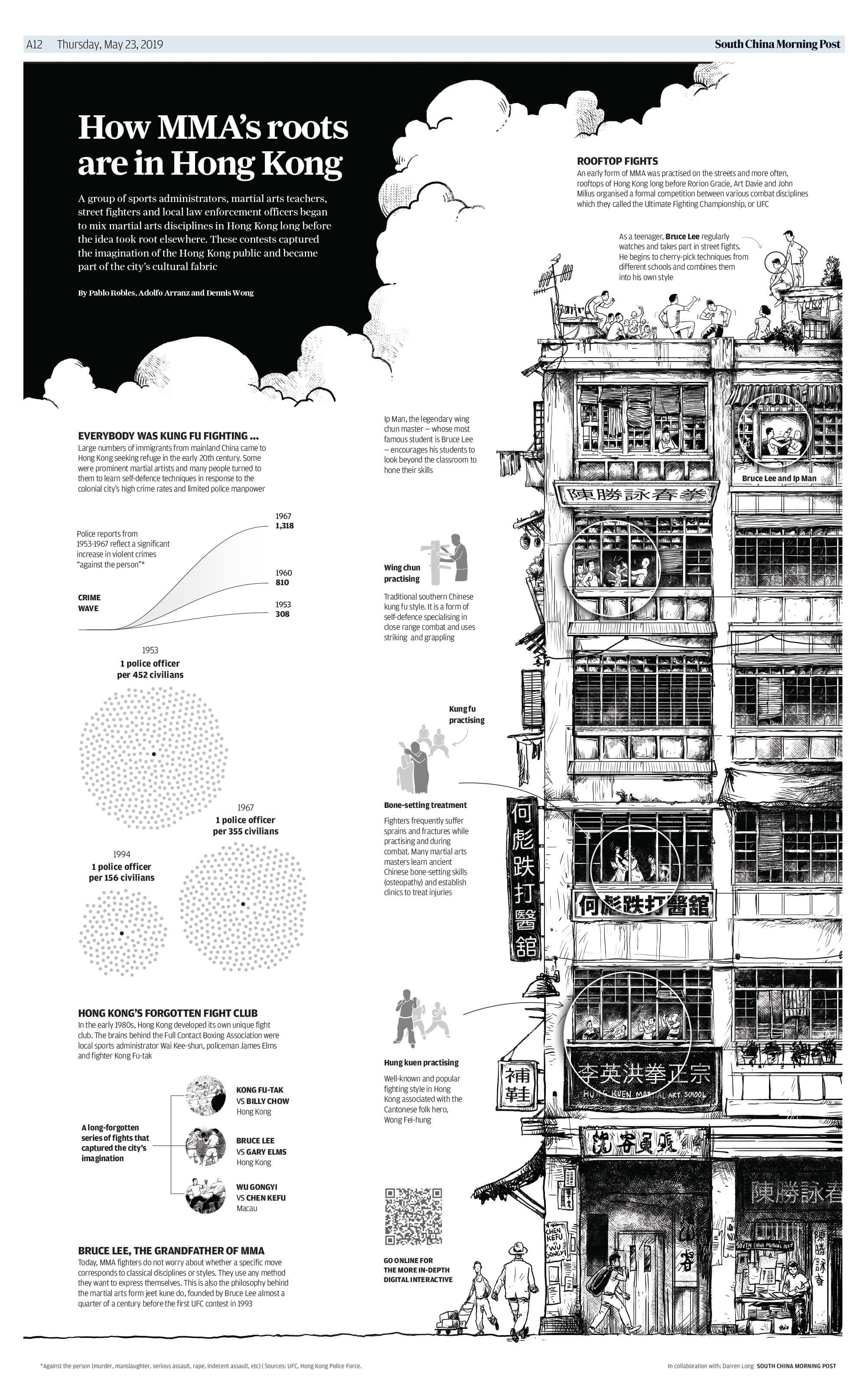
How Bruce Lee and street fighting in Hong Kong helped create MMA

The China Ship

On the move

Must farm

Arrested development

Tradition or exploitation?

The story of a newspaper

Where coal is king

China's wildlife market

How the coronavirus spread in Hong Kong

A question of taste

Creating a modern monster

They are very close ...
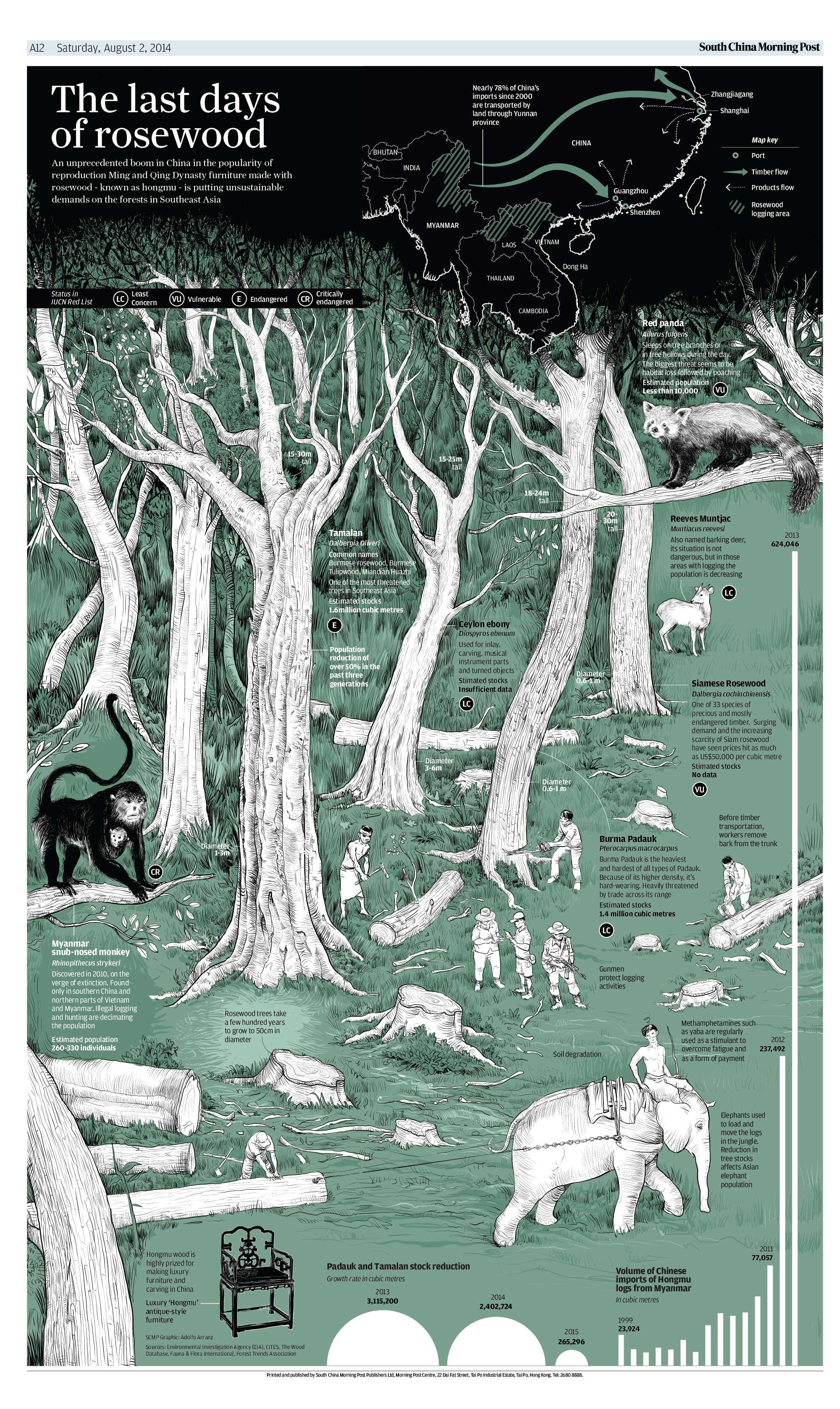
The last days of rosewood